Seunoto Brand Identity and Packaging Design
About
Seunoto is a luxury fashion accessory startup founded in Italy, specializing in limited-edition iPhone and AirPods cases made from premium Italian leather. The brand draws its name and philosophy from 'Sei Uno Otto' (6-1-8) — representing the divine proportion — and creates collections limited to 618 pieces, reflecting the golden ratio.
Duration
03-05.2021
My Role
Brand Designer

The Brief
Seunoto's founders came to me with a highly conceptual vision for their startup launch. They wanted to create a luxury accessory brand that blended:
Italian sophistication with Japanese precision
Visual minimalism with tactile richness (using Braille dots to express "618")
References to prestigious houses like Hermès and Cartier
Eco-conscious materials with premium finishes
They also had specific creative requests: explore merging Braille with Roman numerals or Morse code, use deep red or orange color palettes, and ensure the logotype felt "minimal, tactile, and mysterious."
The target audience was defined as fashion-forward individuals aged 25–35 who follow trends, love luxury goods, and want to express exclusivity — typically wearing Gucci, LV, and Chanel.
The Chalenge
Seunoto faced the classic luxury startup challenge: entering a market dominated by established brands (Hadoro, Labodét, Golden Concept) with existing customer bases and market recognition.
From a design perspective, I needed to:
Unify scattered conceptual ideas (Golden Ratio, Italian-Japanese fusion, Braille tactility) into a coherent brand story
Appeal to a young, trend-conscious audience (25-35) while referencing traditional luxury houses like Hermès and Cartier that typically appeal to older, established wealth.
Help a startup with no market presence establish premium credibility and differentiation

Strategic Analysis
Seunoto wanted to appeal to a fashionable, luxury-driven audience who desired to stand out and be seen as prestigious and exclusive. My research revealed that competitors — Hadoro, Labodét, and Golden Concept — described their audiences in nearly identical ways: "discerning individuals who appreciate craftsmanship," "exclusive clientele seeking prestigious accessories," "fashion-forward luxury consumers."
Their messaging focused almost exclusively on exotic materials (carbon fiber, titanium, crocodile leather) and manufacturing precision. All three competitors were highly product-focused, emphasizing exotic materials and craftsmanship to sell the idea of luxury ownership.
By following the same pattern, Seunoto risked disappearing in the noise.
This communication gap revealed Seunoto's differentiation opportunity: instead of competing on materials and craftsmanship (where established brands had the advantage), Seunoto could compete on philosophical depth and emotional connection.
While competitors sold luxury ownership, Seunoto could sell creative identity and intellectual sophistication.
The client's original concepts — the Golden Ratio and tactile luxury through Braille — were already a strong foundation. I needed to connect them into cohesive visual storytelling and bring philosophical depth.


Positioning Direction
618 isn't just the number of pieces in Seunoto's collections. It's a symbol with hundreds of years of history, strongly connected to Italian heritage and resonating globally with creative audiences. Meanwhile, Braille dots represent tactile feeling — when applied to art, dots are the simplest geometric shapes and the starting point of all creation.
This philosophical depth became the foundation for refining Seunoto's audience definition:
Instead of: Fashion-forward trend-chasers
Position as: Creative individuals with unique personal style
Instead of: Seeking attention and exclusivity
Position as: Young, rebellious, intellectually sophisticated
Instead of: Desiring prestige through luxury ownership
Position as: Expressing identity through philosophical depth and storytelling
This repositioning would differentiate Seunoto not just visually, but strategically — appealing to creative thinkers rather than luxury collectors.
I also recommended removing the Japanese precision element from the brand narrative. While conceptually interesting, it had no authentic connection to an Italian leather product for a global market. Adding "Japanese precision" would dilute the core Italian heritage story and feel inauthentic to the target audience. The client agreed this focus would strengthen rather than weaken the positioning.
Design Exploration

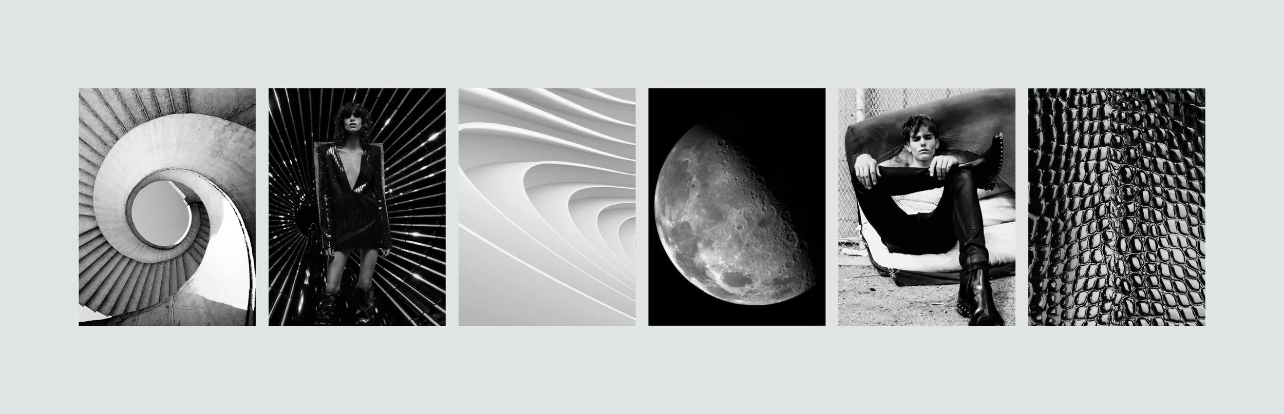
I developed three visual directions to test different strategic territories — each exploring how Seunoto could express philosophical luxury through different emotional lenses.
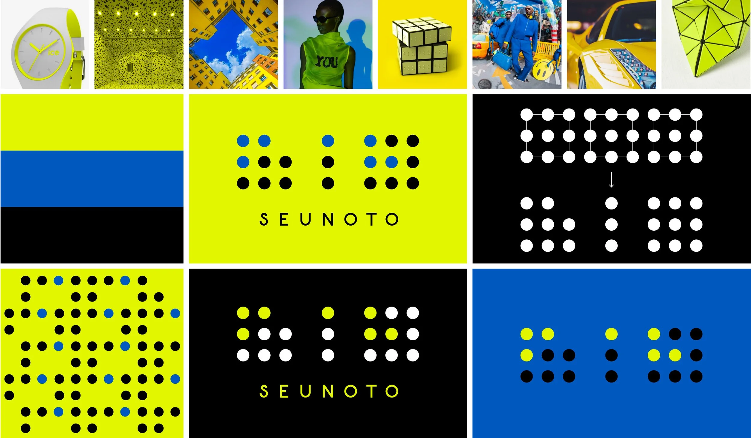
Creative, rebellious, and nonconformist — inspired by Yayoi Kusama's dot works and Braille pattern "618." A visual bridge between contemporary art, fashion, and philosophy.
Option 1: Brightness & Boldness
Artistic and grounded — a classic monogram inspired by Roman numerals, blended with natural materials and earth tones to reflect Seunoto's eco-conscious values.
Option 2: Nature & Classic

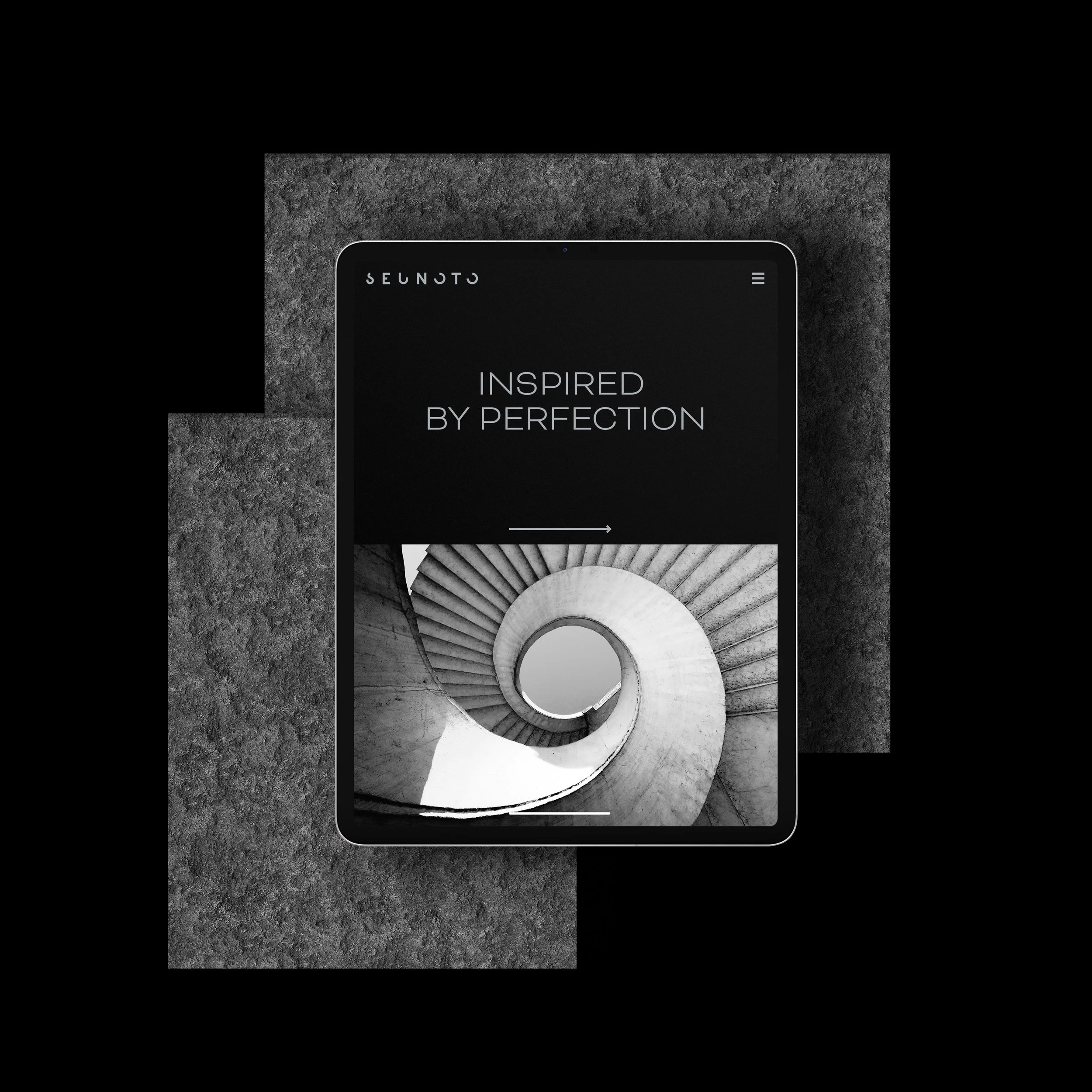
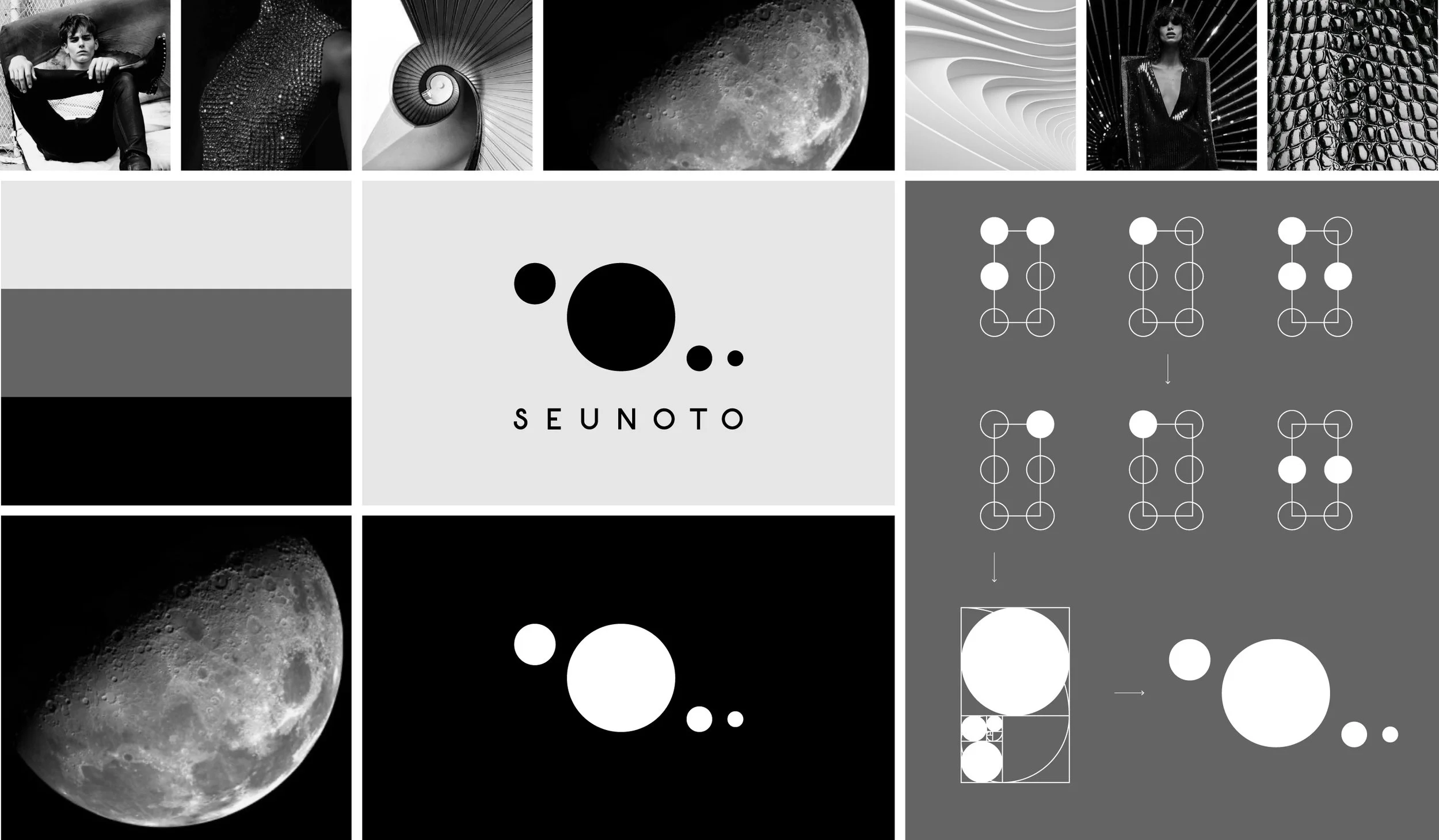
Dark, minimal, and mysterious — a cosmic theme connecting Golden Ratio spirals with Braille dots reimagined as constellations, linking ancient Roman heritage with modern mystique.
Option 3: Timelessness & Mystery
Evaluation
I evaluated each direction against Seunoto's differentiation strategy: which best communicated intellectual depth, creative rebellion, and philosophical sophistication while maintaining luxury credibility?
I recommended Option 3 because it delivered the strongest emotional resonance and clearest differentiation from material-focused competitors. The cosmic / mystery theme connected Golden Ratio philosophy with modern mystique in a way that felt both intellectually sophisticated and visually ownable. The CEO agreed.
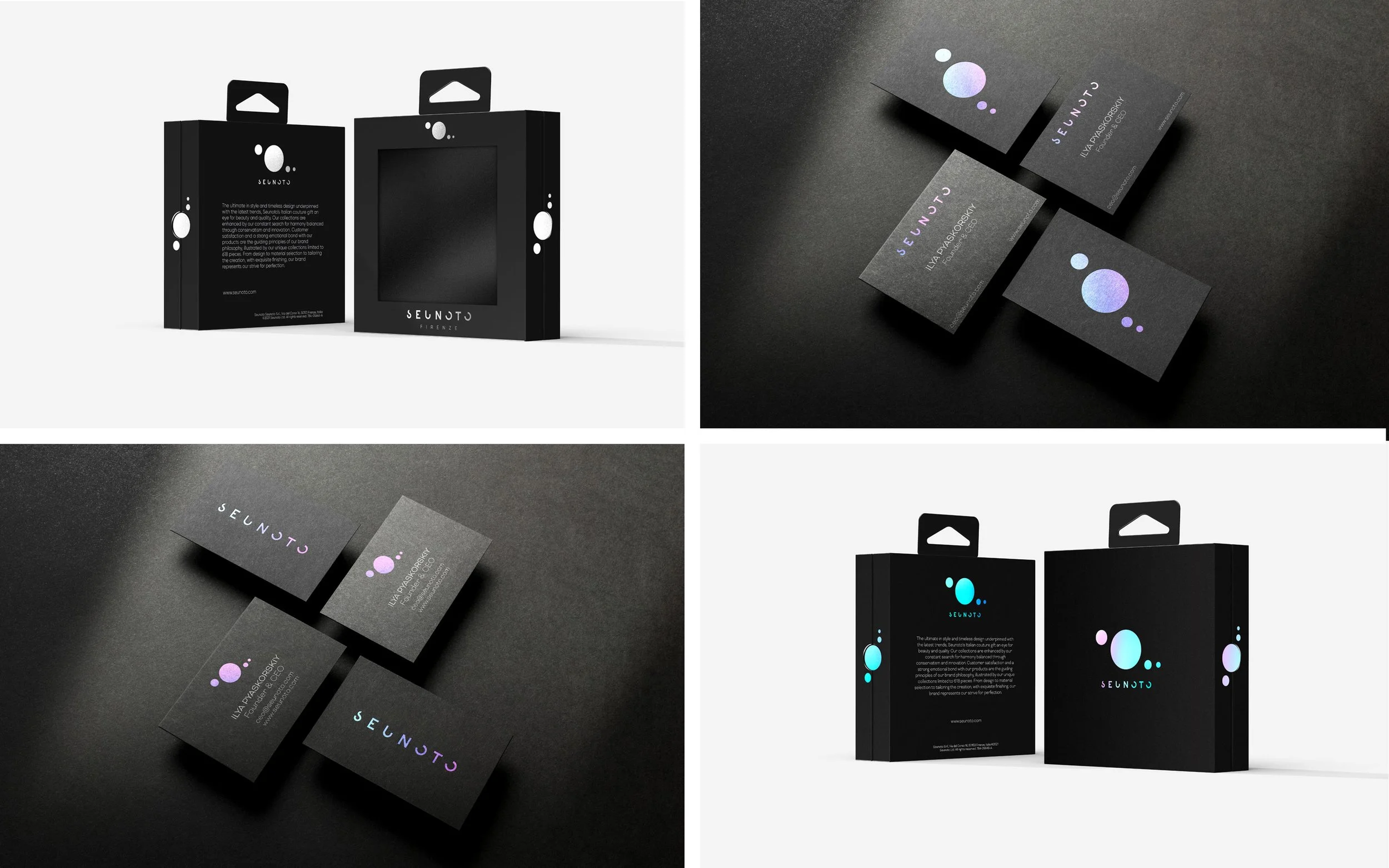
Finalization & Production
I simplified the Braille "618" into four geometric circles using Golden Ratio proportions, then customized the typography by removing letter segments to add mystery and dimensional depth.
Build Elements
The visual identity and packaging system combined symmetrical layouts and eco-luxury paper with holographic foil finishes — expressing creative rebellion within refined minimalism.
Visual Identity
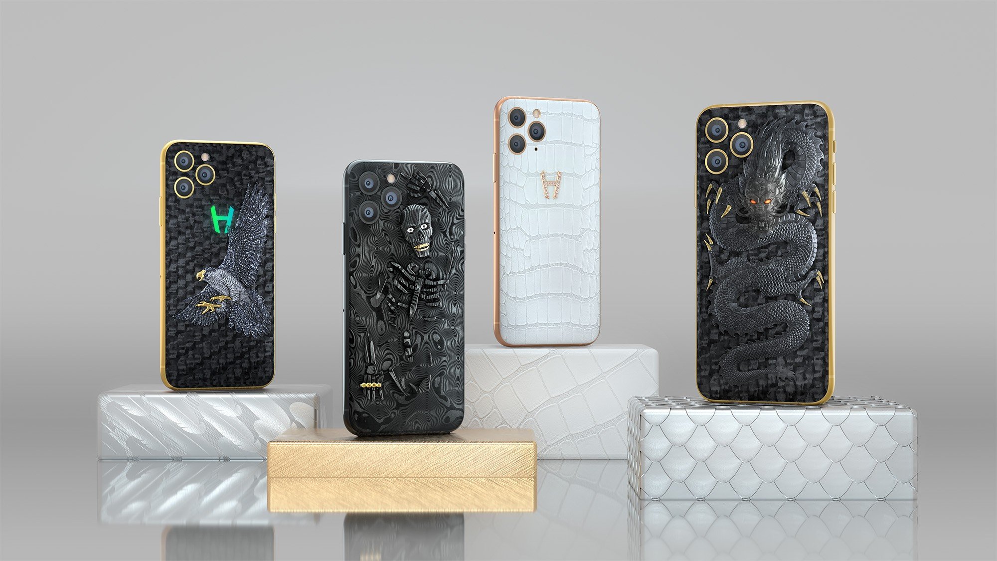
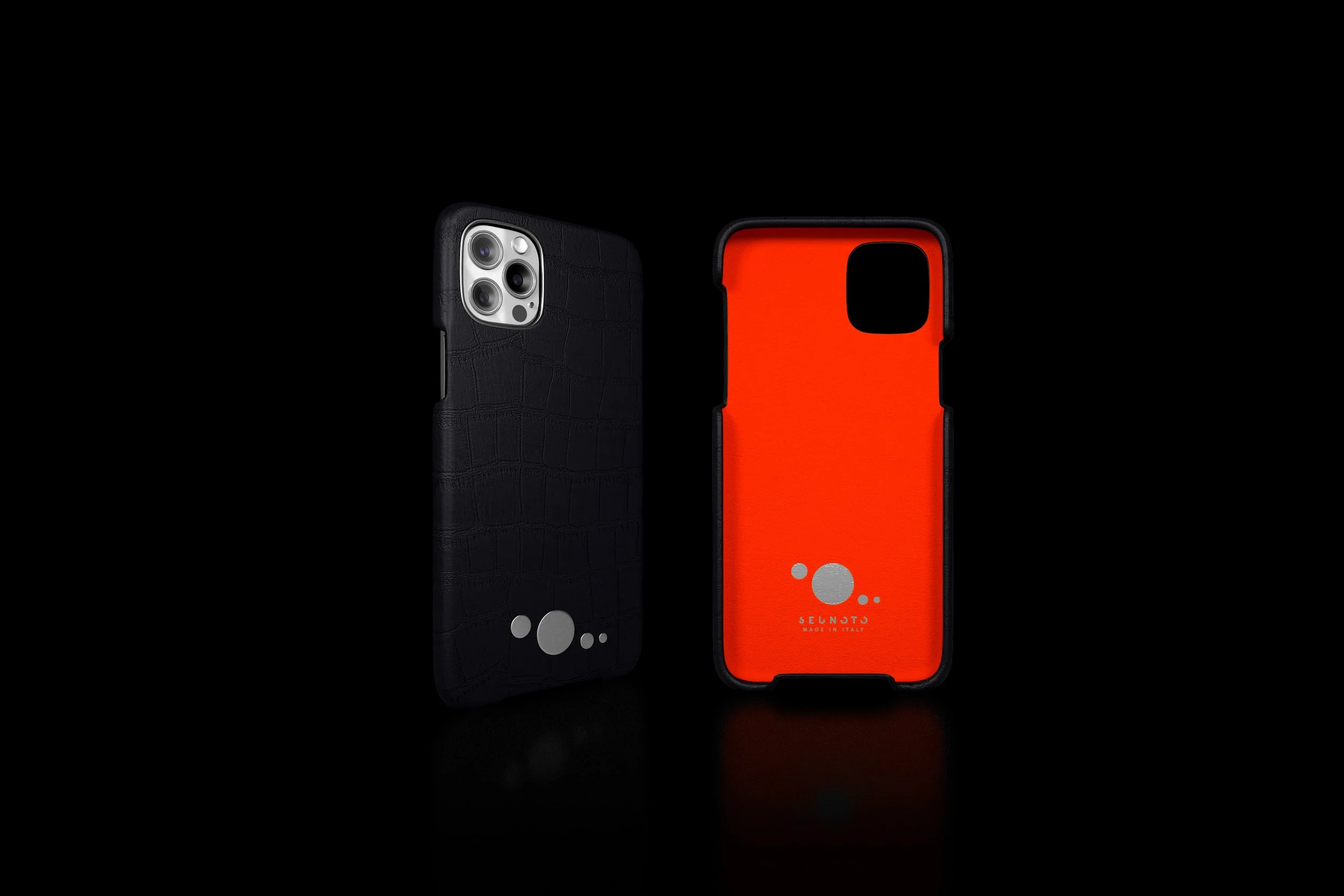
Product Design
To strengthen the luxury craftsmanship feeling, I wanted to print each dot separately and apply them individually rather than engrave the logo. I coordinated with three Chinese factories to produce prototypes and test feasibility.
However, testing revealed the smallest dot couldn't be physically produced at that scale. I revised the logo proportions specifically for iPhone case application — a reminder that even mathematically perfect proportions must adapt to manufacturing constraints.
The Outcome
The brand identity launched successfully in 2022, enabling Seunoto to enter the luxury tech accessories market with clear differentiation from established competitors.
The client returned for investor presentation design and commissioned me for a second brand collaboration, indicating satisfaction with both creative quality and business results.

The project became one of my most-viewed works on Behance (15k views, 2 features) and continues to generate inbound inquiries for luxury branding projects — suggesting the strategic positioning and visual execution resonated with both the design community and potential clients.
While the brand successfully launched, it's no longer actively operating. This project demonstrated how thoughtful brand philosophy and strategic positioning can help startups differentiate in crowded luxury markets — even when market success depends on factors beyond brand design.