MyPower Corp. Visual Identity
About
MyPower Corp. is an 100% affiliate of Japan's conglomerate, Mitsui & Co., Ltd. that delivers industrial solutions for global climate change.
My Role
Visual Brand Designer
Duration
05-07.2022

The Brief
As a newly established company, MyPower Corp. needed a visual identity to connect with its audience, communicate its values and goals, and stand out from competitors.
MyPower came to me with a straightforward brief: create a modern logo that expressed sustainability, nature, and business. Implement trust worth and stability, as a Mitsui subsidiary, and make it look futuristic to represent the focus on future of the planet.
But when I researched the company online, I discovered a missing positioning opportunity the brief hadn't addressed.
The Challenge
Design a logo and visual identity that balance several diverse messages:
Express sustainability, nature, growth, and investment
Convey trust and stability as a Mitsui subsidiary
Look futuristic to represent innovation and progress
The Process
Analysis
MyPower Corp.'s brief asked for a logo that expressed sustainability, nature, business growth, investment, trust, and innovation. But when everything is important, nothing is important. Trying to merge all these messages into one mark would create visual clutter and unclear communication.
I needed to narrow the direction and identify which messages mattered most.
While analyzing the brand and its services, I discovered that MyPower's audience extended far beyond the business and investment sector. The company not only supported corporate clients but also collaborated with local governments, schools, hospitals, and communities—enabling residents to join renewable energy programs and receive monthly electricity discounts. The brief hadn't mentioned this residential audience at all.
I also analyzed MyPower's competitive landscape and found that most renewable energy companies used clean but impersonal visuals emphasizing technology over human connection — all speaking primarily to corporate audiences.
If the identity focused too much on "business, growth, and investments," MyPower would risk alienating community audiences—limiting their ability to scale residential programs and missing the opportunity to differentiate where competitors were identical.
This discovery revealed what to prioritize. Expanding the audience might sound counterintuitive when you're trying to narrow the direction—but understanding the full audience helped me narrow the brief strategically. Instead of cramming "business, growth, and investment" alongside everything else, I could focus on what made MyPower unique: a human-centered approach to renewable energy that served both corporate and community needs.
Exploration
From this insight, I defined four key design priorities:
Sustainability and nature – core to the company's mission
Human-centric warmth – to engage communities and resonate with residential audiences
Modern feel – to represent forward-focused innovation
Stability and trust – to reflect Mitsui's credibility
To achieve this, I decided to design a modern logomark representing sustainability and progress, use friendly shapes and colors to express approachability, and maintain corporate clarity in layouts to convey professionalism and trust.
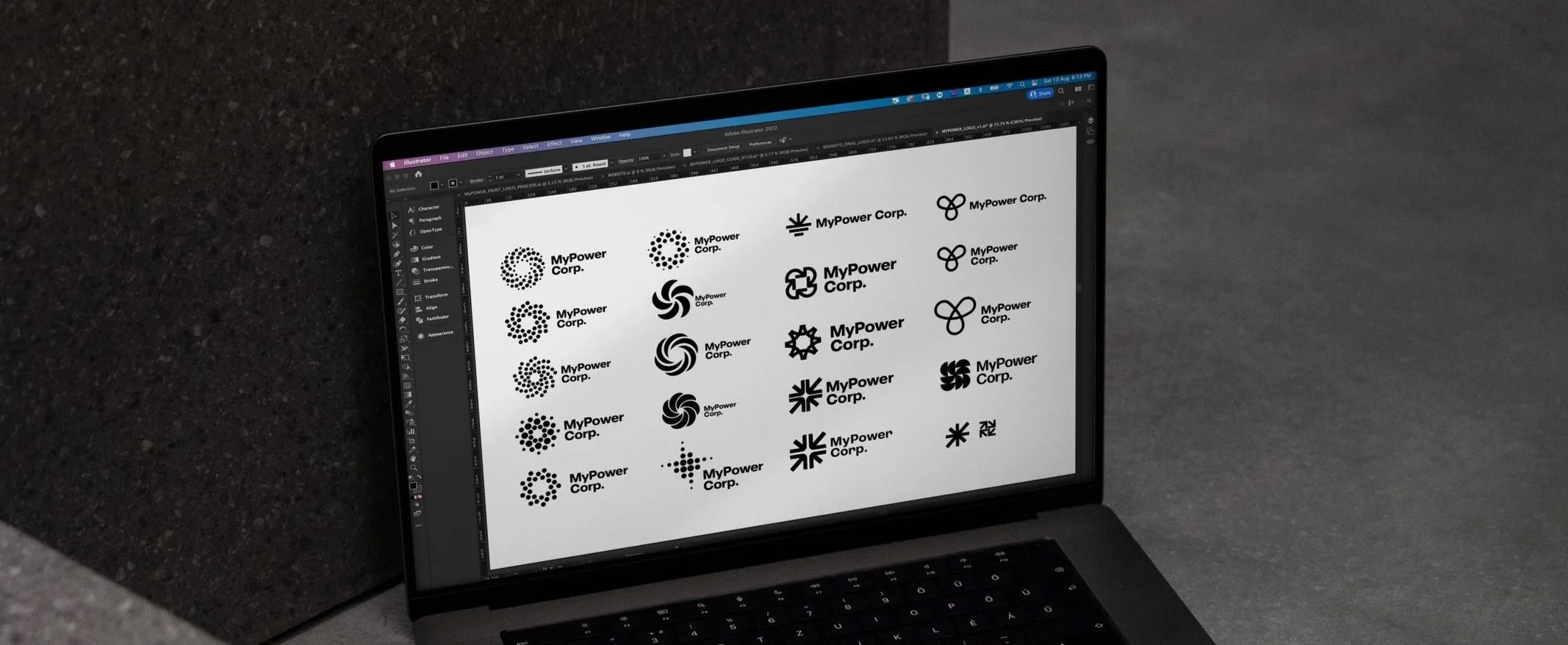
I explored several ideas following this direction. [exploration options]
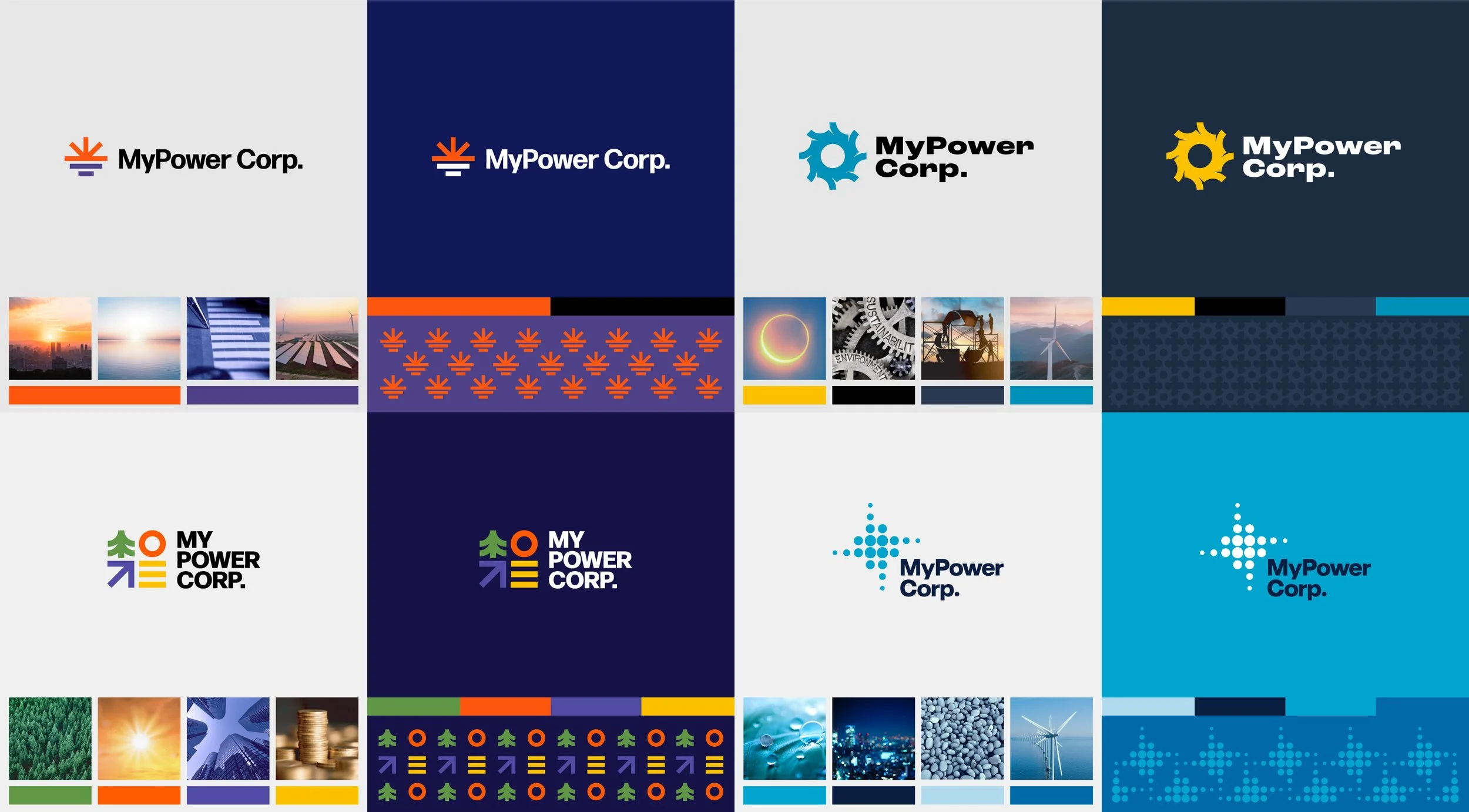
The Solution
I presented finalized concepts to the leadership team, each evaluated against our four design priorities. The 'Dotted Star' direction scored strongest across all criteria — it felt modern and sustainable while maintaining approachability.
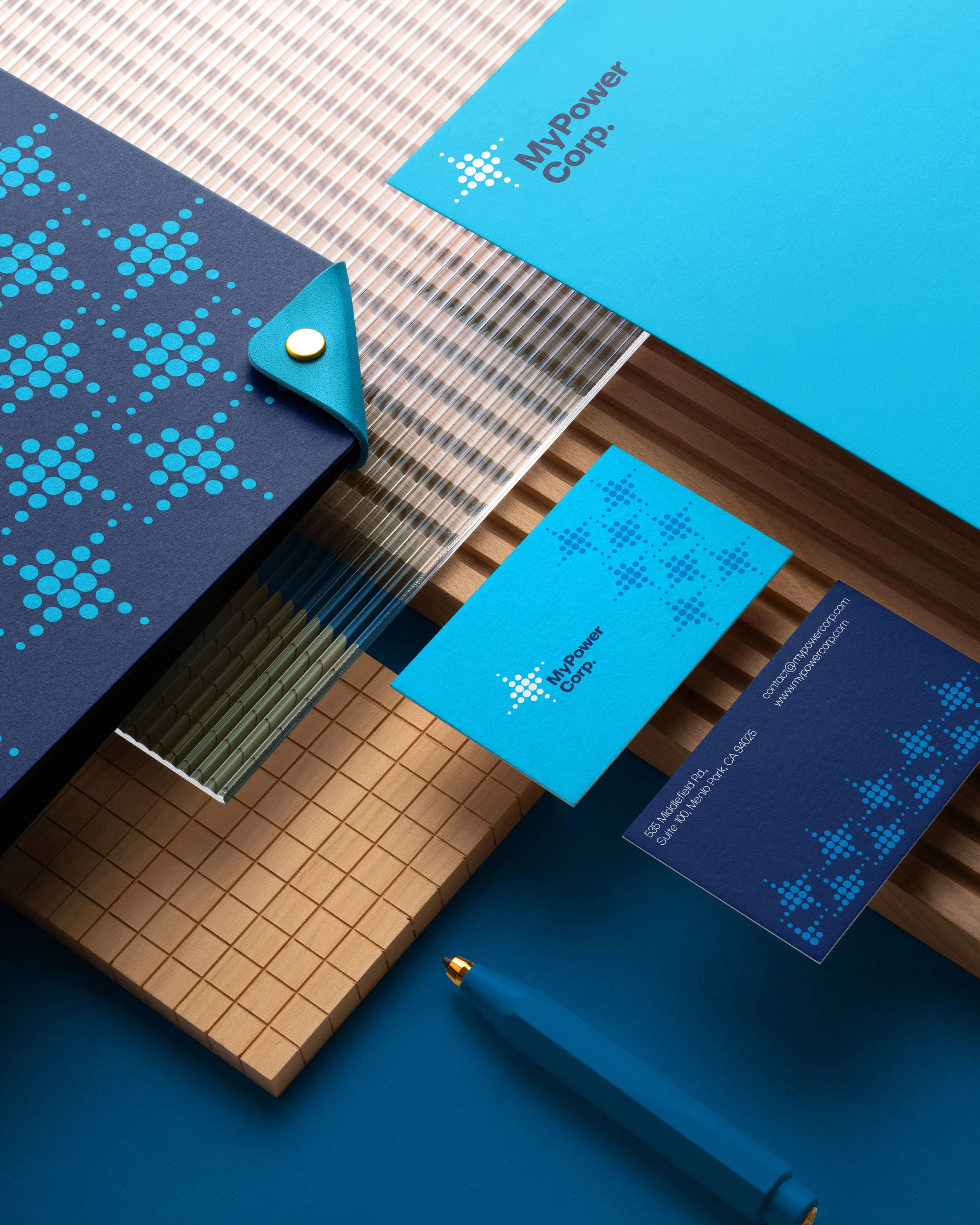
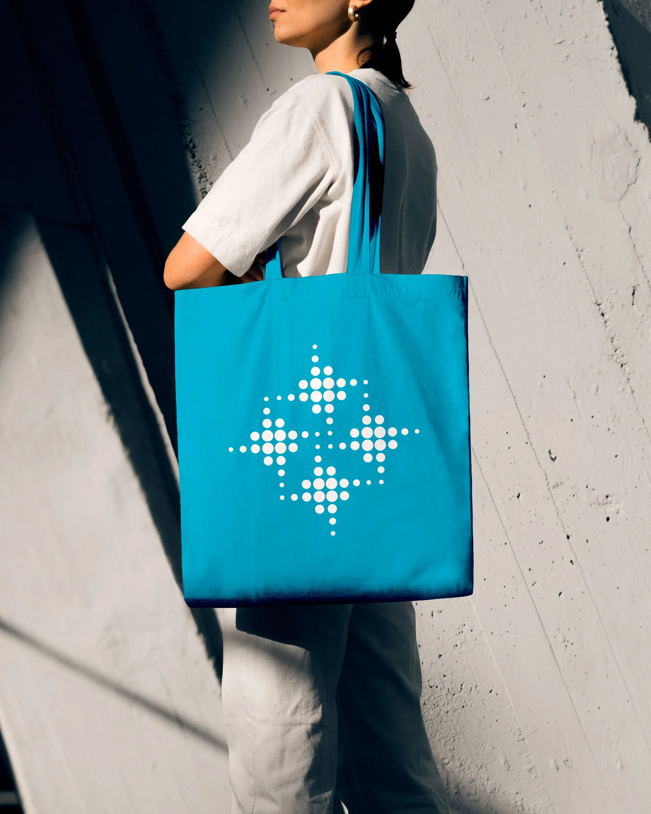
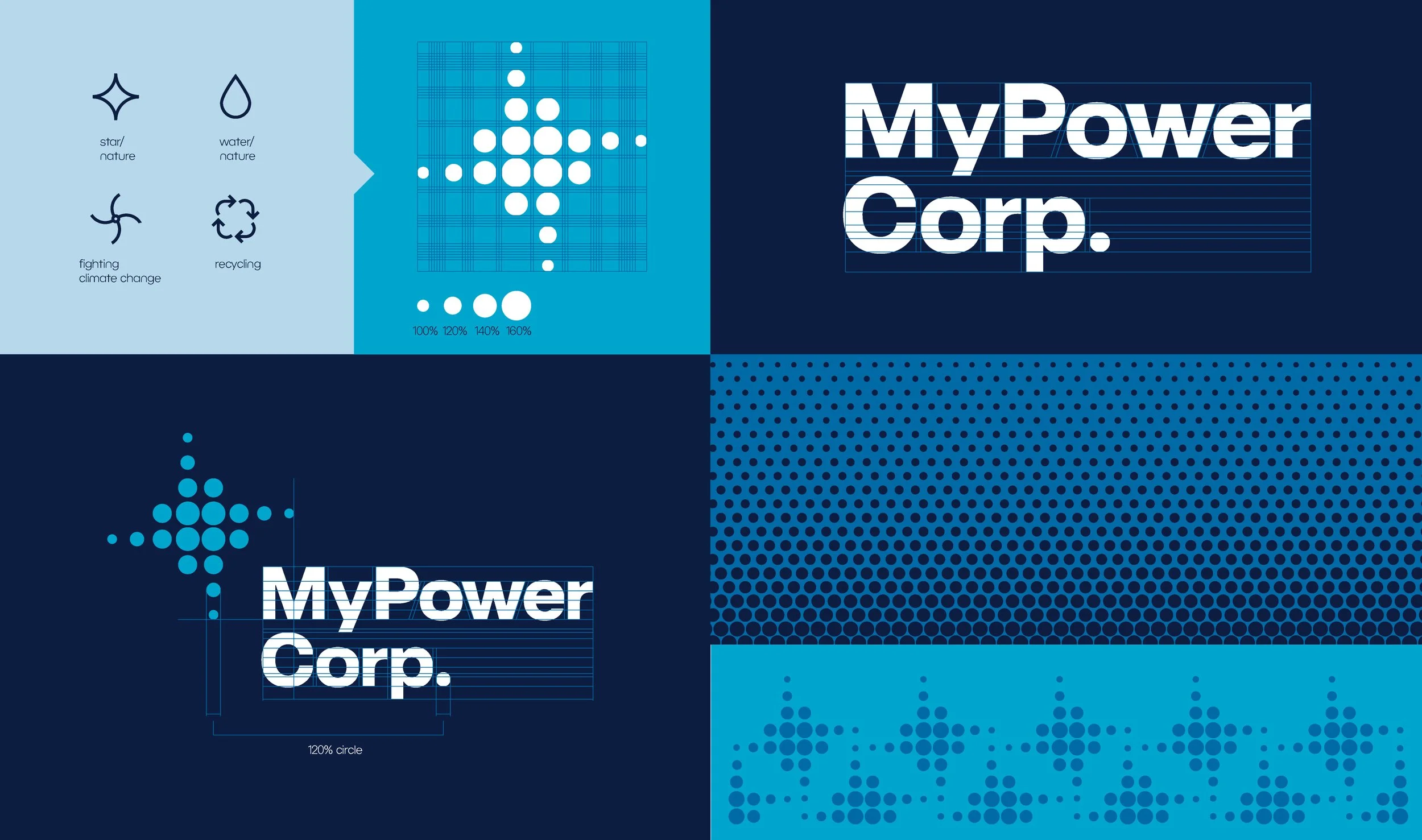
'Dotted Star' — a modern symbol that intuitively represents energy, connection, and renewal, while evoking the North Star as a metaphor for guidance and progress.
Its vibrant blue palette adds a natural, human touch while referencing clean energy and sustainability, and the timeless, minimal layouts convey trust and stability.
The leadership team validated this assessment, noting it captured the brand's vision more completely than other options.
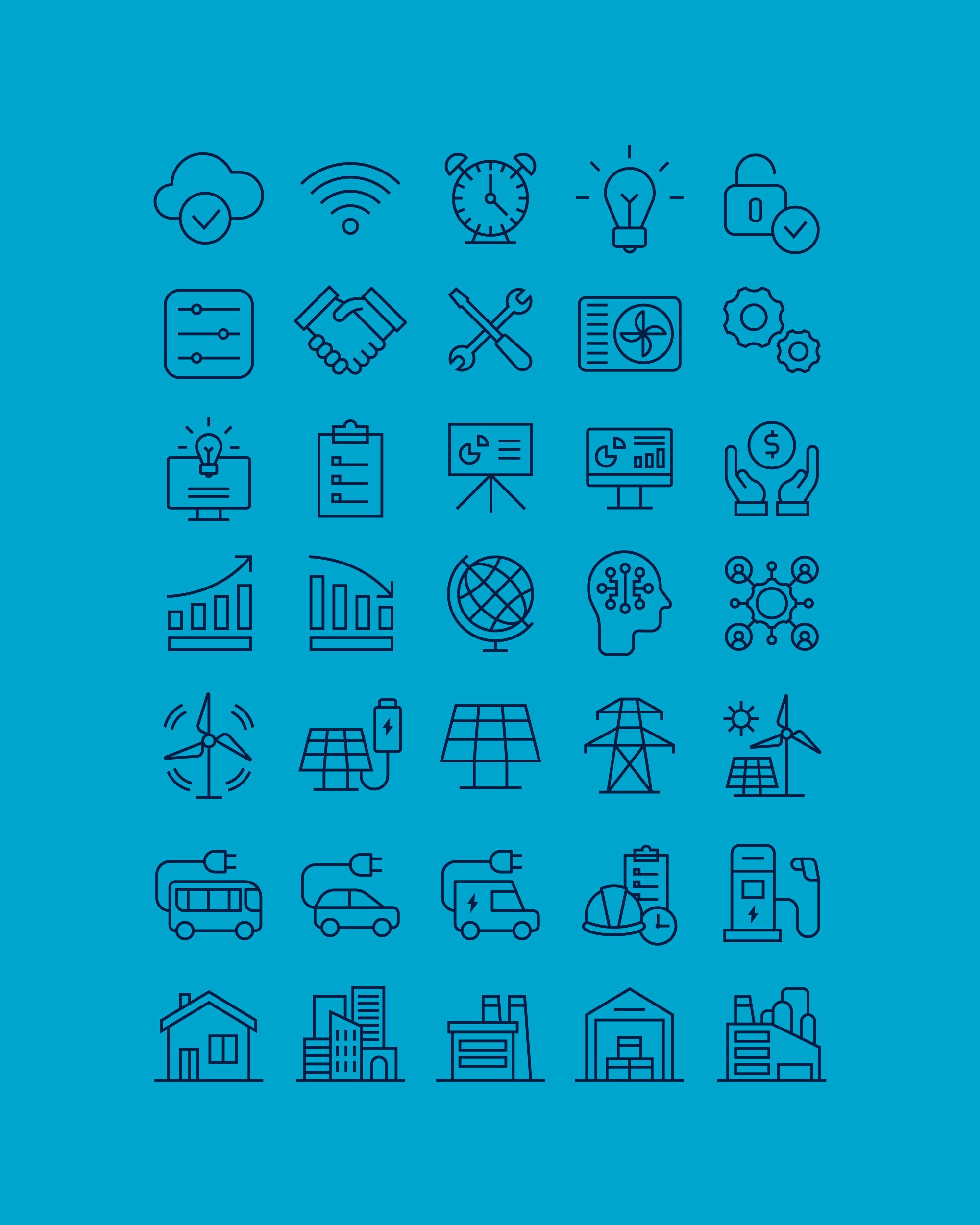
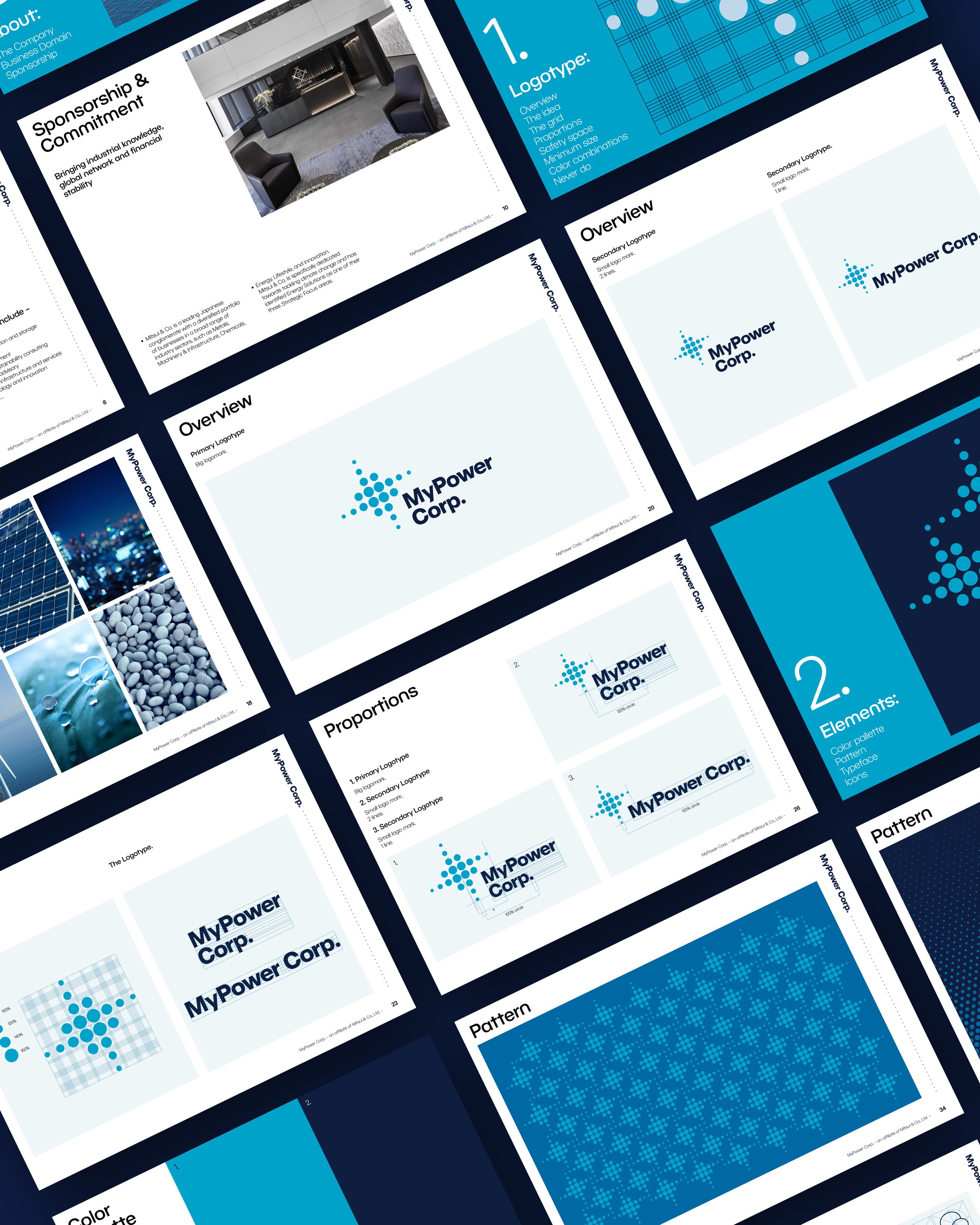
Following this direction, I developed the visual identity, corporate decks, social media templates, and a comprehensive brand guideline outlining usage rules and examples.
The Outcome
The identity launched in 2022 and remains in active use without modifications — demonstrating its strategic durability and adaptability across diverse touchpoints.
The human-centered approach successfully differentiated MyPower in a commoditized market, though I didn't track quantitative brand recognition metrics post-launch.