Cleer Brand Repositioning Concept
About
Cleer is a premium lifestyle audio brand based in California.
My Role
Art Director
Duration
03-08.2020

The Context
While positioned as a Californian brand, Cleer was owned by Chinese manufacturer Grandsun Co. LTD., where I worked as Art Director for a different Grandsun brand.
Although Cleer performed well in the U.S. market, it struggled to gain traction in China's highly competitive audio market. Despite exhibiting at CES and winning design awards, Cleer's sales in China remained minimal compared to local competitors like Edifier and international brands like Sony and Bose.
Management decided Cleer needed to better connect with younger Chinese audiences.
Even though Cleer had its own design team in the USA, they asked me to develop a new brand identity concept alongside my usual responsibilities, because I was located in China and was closely working with the targeted market. I accepted because I saw an opportunity to solve a genuine strategic challenge — and Cleer clearly had one.

The Brief
Cleer aimed to increase its presence in the Chinese audio market by connecting with a younger audience—without losing its premium positioning.
Brand management wanted a refreshed identity that:
Attracted younger Chinese consumers
Expressed the brand’s Californian origin
Felt timeless and premium to support a higher price point
Used minimal, clean design language inspired by B&O campaigns
The Challenge
Create a visual identity that reconciles multiple strategic tensions:
Appeal to young Chinese consumers while expressing Californian brand origins
Feel premium and timeless (to justify higher pricing) while attracting youth culture
Stand out in a crowded market while maintaining minimal, clean aesthetics
Address these brand challenges without ability to change the product design itself
Additionally, I needed to deliver this while managing my primary responsibilities for another Grandsun brand — meaning research and execution would need to be resourceful and efficient.
My Approach
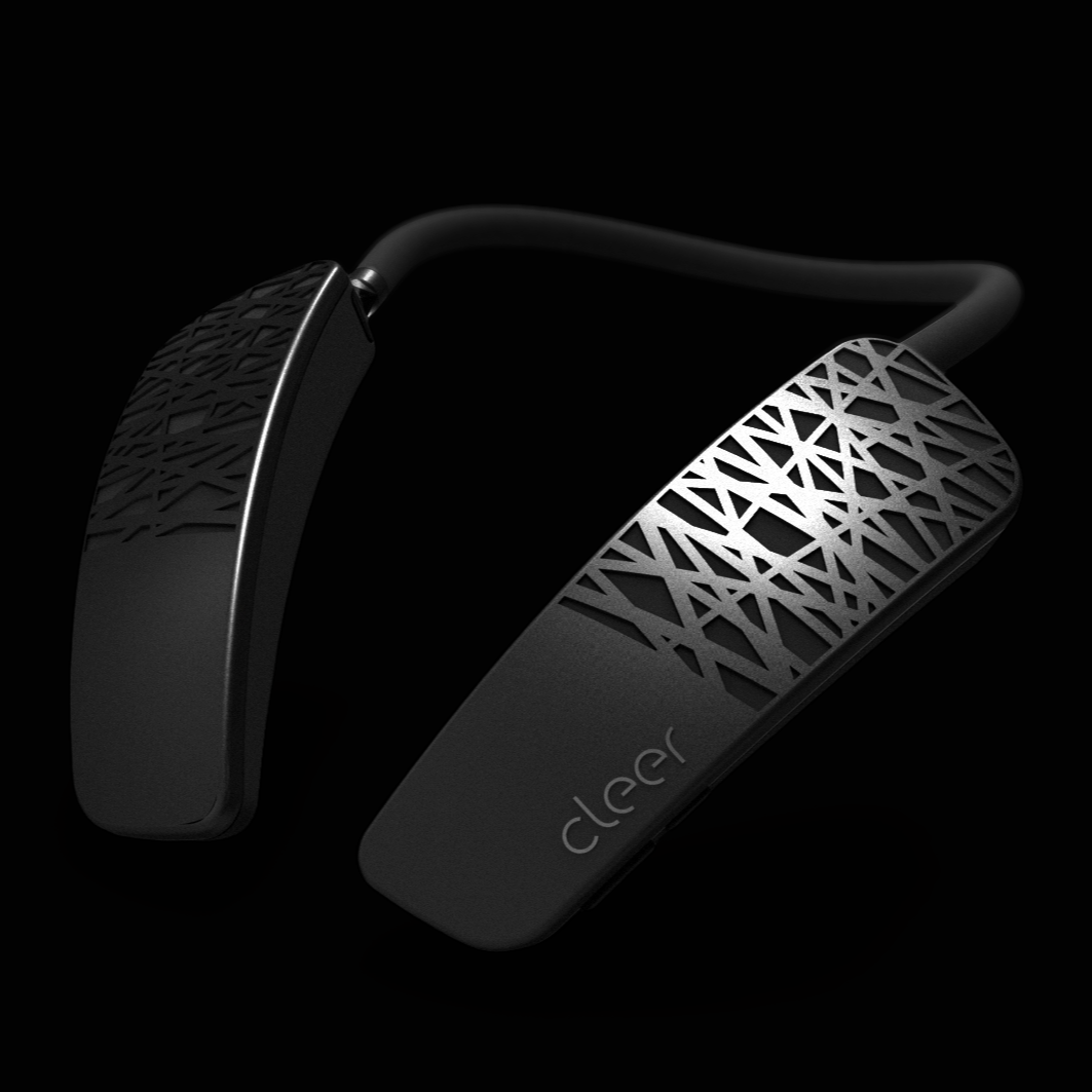
Before diving into market research, I analyzed Cleer's existing products and brand materials. The strategic disconnect was immediately apparent. While Cleer wanted to appear timeless, minimalistic, and premium, their product design looked dated and bulky. Some home speakers and earbuds could pass as “timeless,” but their headsets, portable speakers, and neck speakers followed a retro-futuristic aesthetic that felt more sci-fi than minimalist luxury.
First Drafts
Minimalist packaging clashed with heavy product forms and looked misplaced. Clean, modern renders made the products disappear in a sea of similar competitors — most of whom offered much lower prices. Referencing B&O campaigns was also misguided; their fashion-driven storytelling spoke to a completely different audience.
The brief was non-negotiable — stakeholders insisted on sticking to the “timeless and minimal” direction. I created several design options following that guideline, but none of them worked.
The real issue wasn’t aesthetic — it was a strategic gap between how Cleer saw itself and how its products communicated in reality. Continuing down this path wouldn’t solve the business problem. Even the most beautiful minimalist identity wouldn’t connect emotionally with anyone; the brand would still be lost among competitors.
Changing Direction
To move forward, I needed to flip the approach: instead of branding around an idea, I had to brand around the product itself. If the product design couldn’t change, I had to make it the hero — not the obstacle.
The key question became: how could I make the bulky, retro product design a feature, not a flaw?
And how could I tie that to Cleer’s Californian story in a way that resonated with young Chinese consumers?
Without budget for formal market research, I conducted informal interviews with 50 younger Grandsun employees (ages 22-32) to understand Chinese perceptions of California. Their most common associations were: Hollywood, Freedom, Celebrities, and Spacious landscapes.
These became the foundation for the new direction:
“Hollywood” and “Celebrities” suggested a movie theme
“Freedom” pointed to youth and rebellion
“Spacious landscapes” offered a perfect visual narrative for photography
But I still needed to link these ideas to Cleer’s retro-futuristic product design.


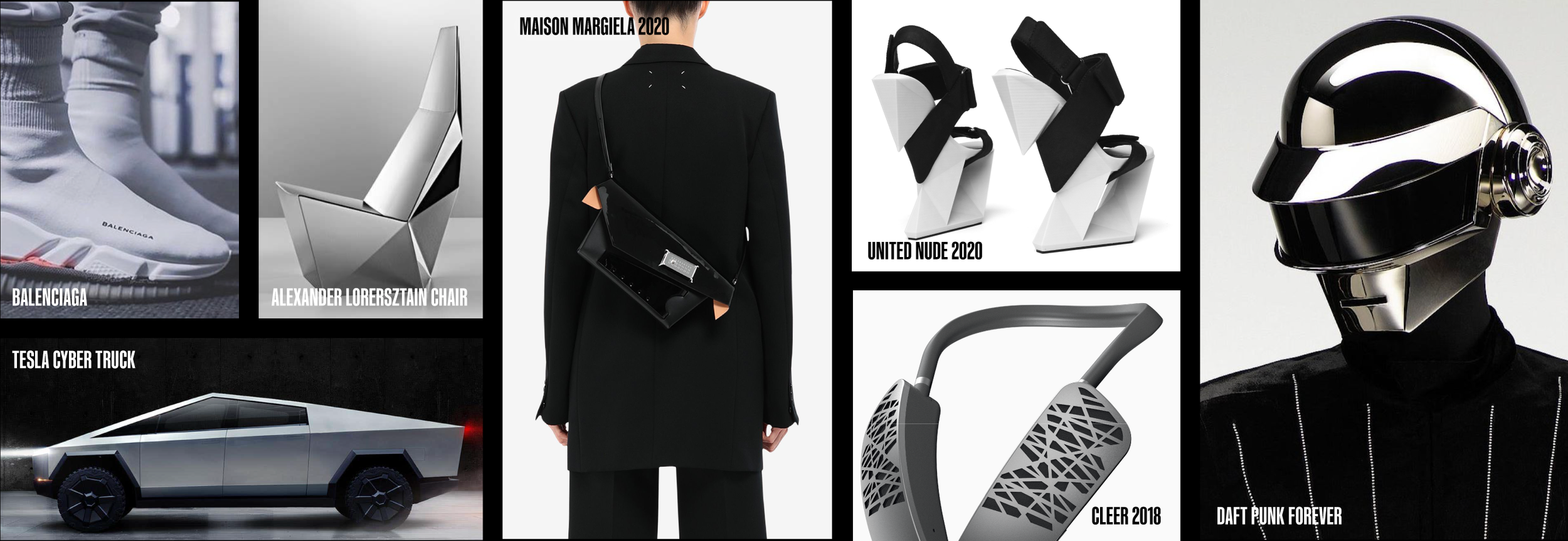
Analyzing fashion, lifestyle, and social trends 2019-2020 revealed a strong nostalgia-futurism fusion:
Brands like Balenciaga, Dsquared2, and Louis Vuitton reintroduced bold, kitschy 90s aesthetics
Legacy houses like Chanel connected to youth culture through icons like Billie Eilish
Apps like Huji Cam and Dazz Cam that simulated disposable-camera effects were trending across social media
Tesla Cybertruck, Alexander Lorenz’s retro-futuristic pieces, and Daft Punk’s iconic helmets normalized bulkiness as “cool” again
Suddenly, it all aligned — Cleer’s products could shift from dated to cult-retro, from old-fashioned to rebelliously alternative.
They could become part of a global cultural wave rather than victims of outdated design.

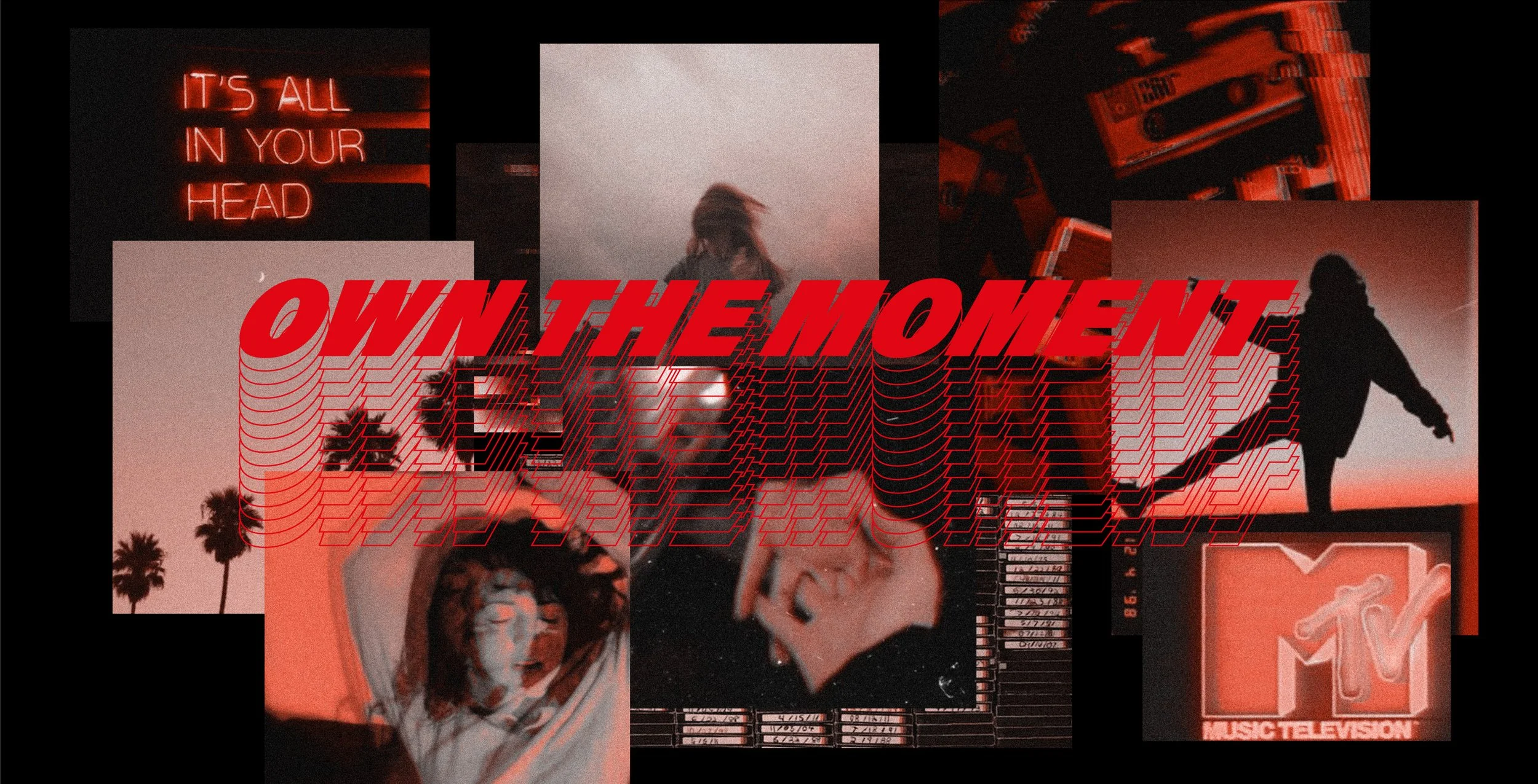
Cinematic
Spacious
Nostalgia
Youth
Music
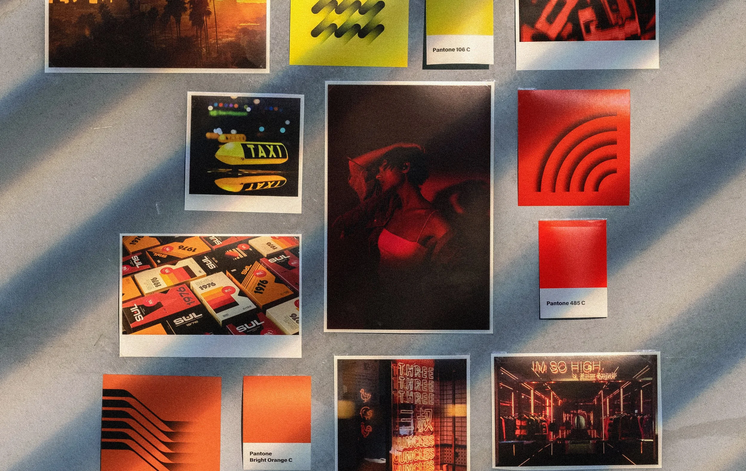
The mood board
The Design Process
With these cultural insights defined, I needed a visual system that could unite them— something that felt authentically retro-futuristic, cinematically Californian, and culturally resonant with Chinese audiences.
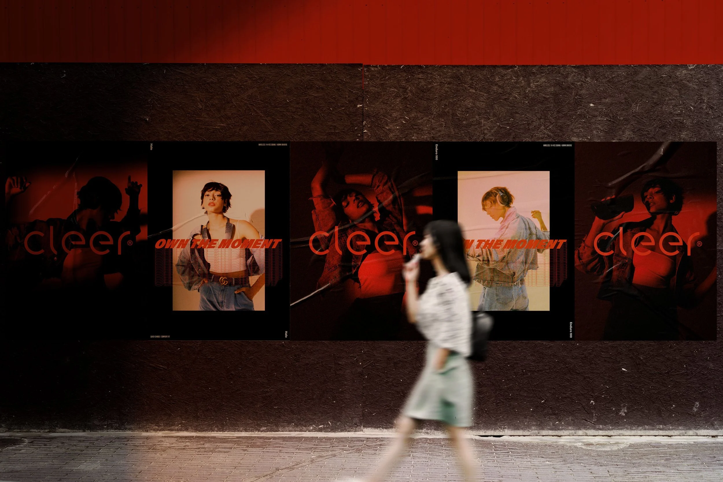
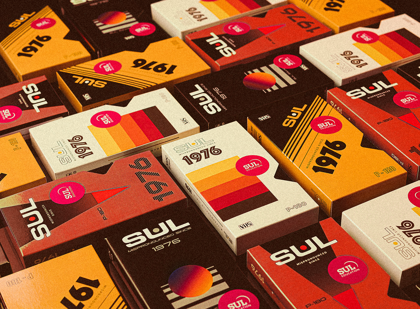
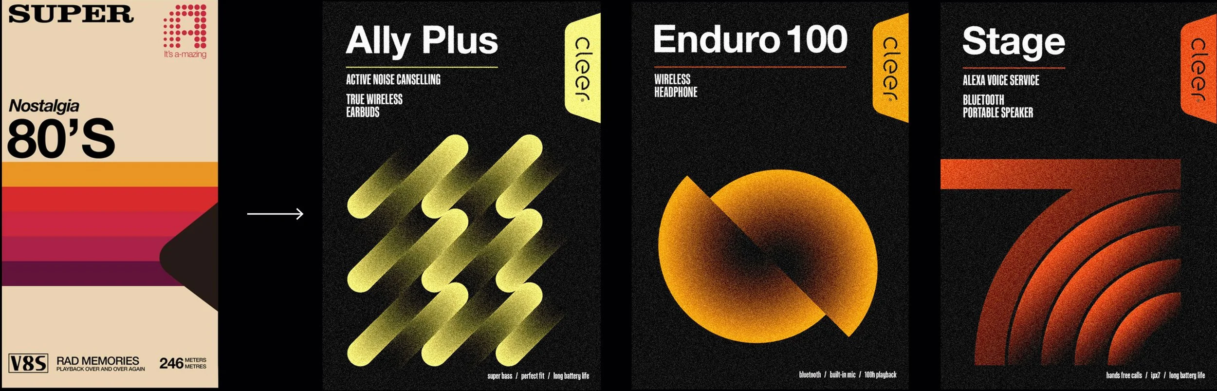
I found the answer in 90s video tapes. Their bold, graphic look supported the retro-futuristic aesthetic and spoke to both generations: nostalgic for older audiences, trendy for younger ones.
Key design decisions:
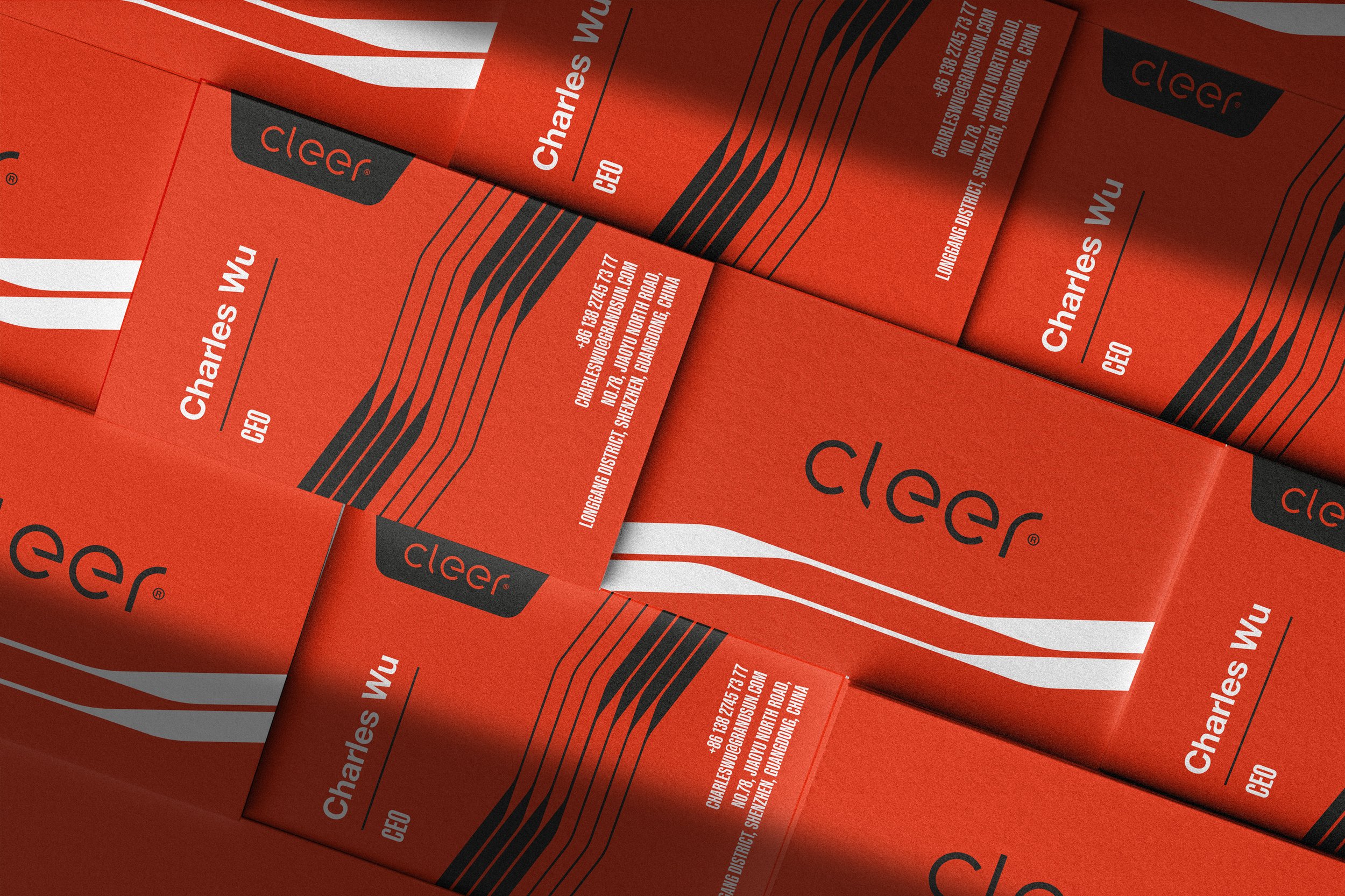
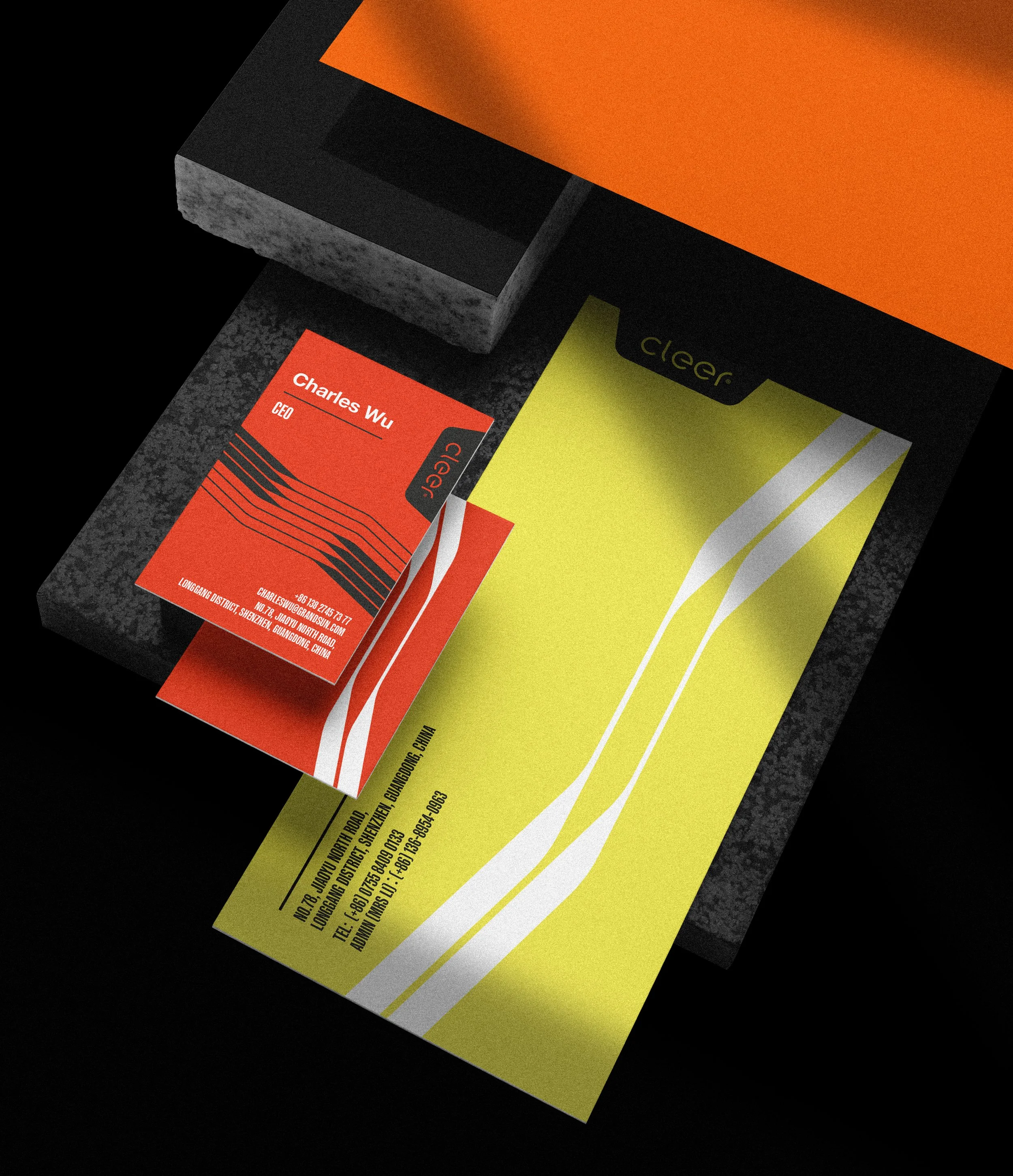
Used warm orange and red tones — colors traditional in Chinese culture — blending the hues of Californian sunsets with red Chinatown light
Color selection

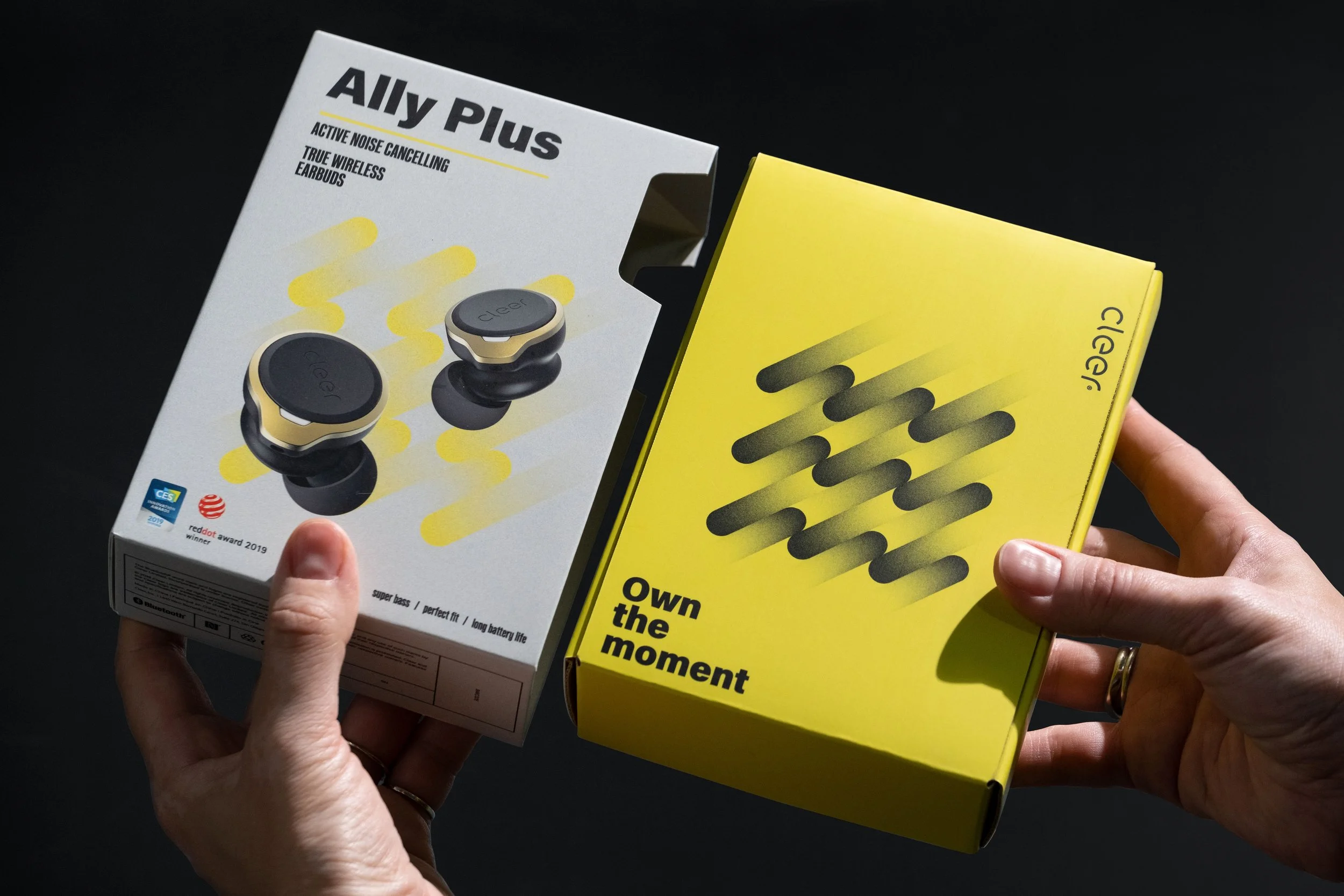
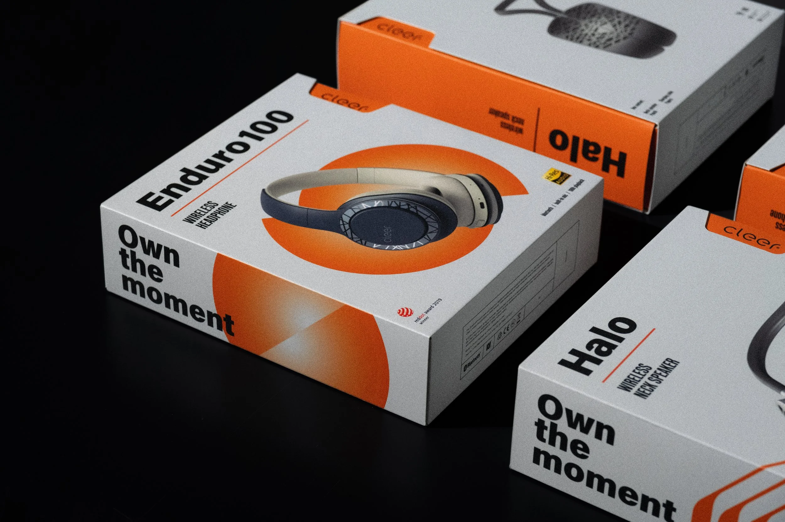
Used bold graphics inspired by VHS covers and added noisy gradients to modernize the look.
Added a die-cut window reminiscent of tape packaging to strengthen the movie and retro association
Graphics & Shapes
Imagery
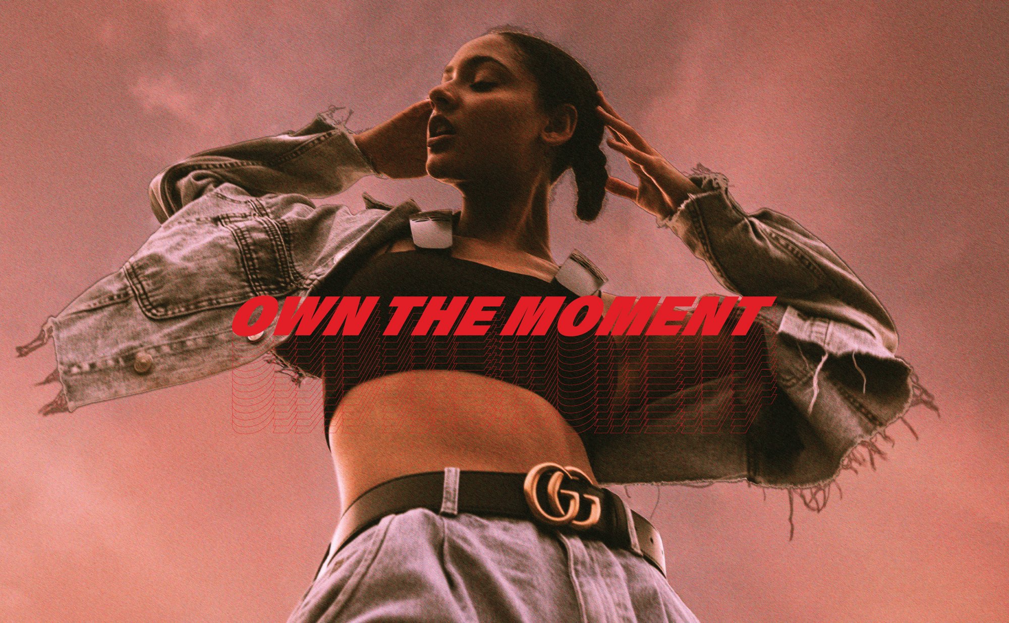
Defined a grainy, film-style photography direction to evoke nostalgia and authenticity
I secured free packaging samples from Grandsun’s factory to make the product feel complete and real.
Packaging Samples

To demonstrate how the identity would work beyond packaging, I collaborated with Grandsun's CMF (Color, Material, Finish) and industrial design teams to develop a pop-up retail concept. This showed stakeholders how the brand could create an immersive, Instagram-worthy retail experience that would drive foot traffic and social media engagement in Chinese shopping malls.
Pop-up Design

I invested personal funds to hire a photography studio, selected outfits, styled the model, and directed the shoot. The result was a series of studio close-ups and film-style outdoor shots capturing the mood of California’s open air. Some of the images were taken on film to strengthen the retro look and feel.
Photoshoot


The Presentation
I compiled the full process — from insights to execution — into a comprehensive presentation deck for management.

The Outcome
With support from Grandsun’s design director, we presented the new concept to Cleer stakeholders — and it was completely rejected.
They refused to move away from their established brand perception, despite clear reasoning and cultural evidence.
However, I later observed elements of this visual direction appearing in Cleer's Chinese market materials—orange-red color palettes, grainy gradients, and bold graphics that departed from their previous minimal aesthetic—suggesting the strategic insights had impact even without formal adoption.
What I Learned
This project taught me three critical lessons about strategic design:
1. Product-first branding can work: When product design is fixed, making it the hero rather than fighting it can reveal unexpected positioning opportunities.
2. Resourceful research beats no research: Without formal market research budget, interviewing internal employees and analyzing cultural trends still yielded actionable strategic insights.
3. Stakeholder readiness matters as much as creative strategy: No matter how culturally grounded or strategically sound a recommendation is, organizational change requires leadership willing to challenge their own brand assumptions. Assessing change readiness is now part of my strategic process.